
/
The Final Solution to the Jewish Question by Dara Horn
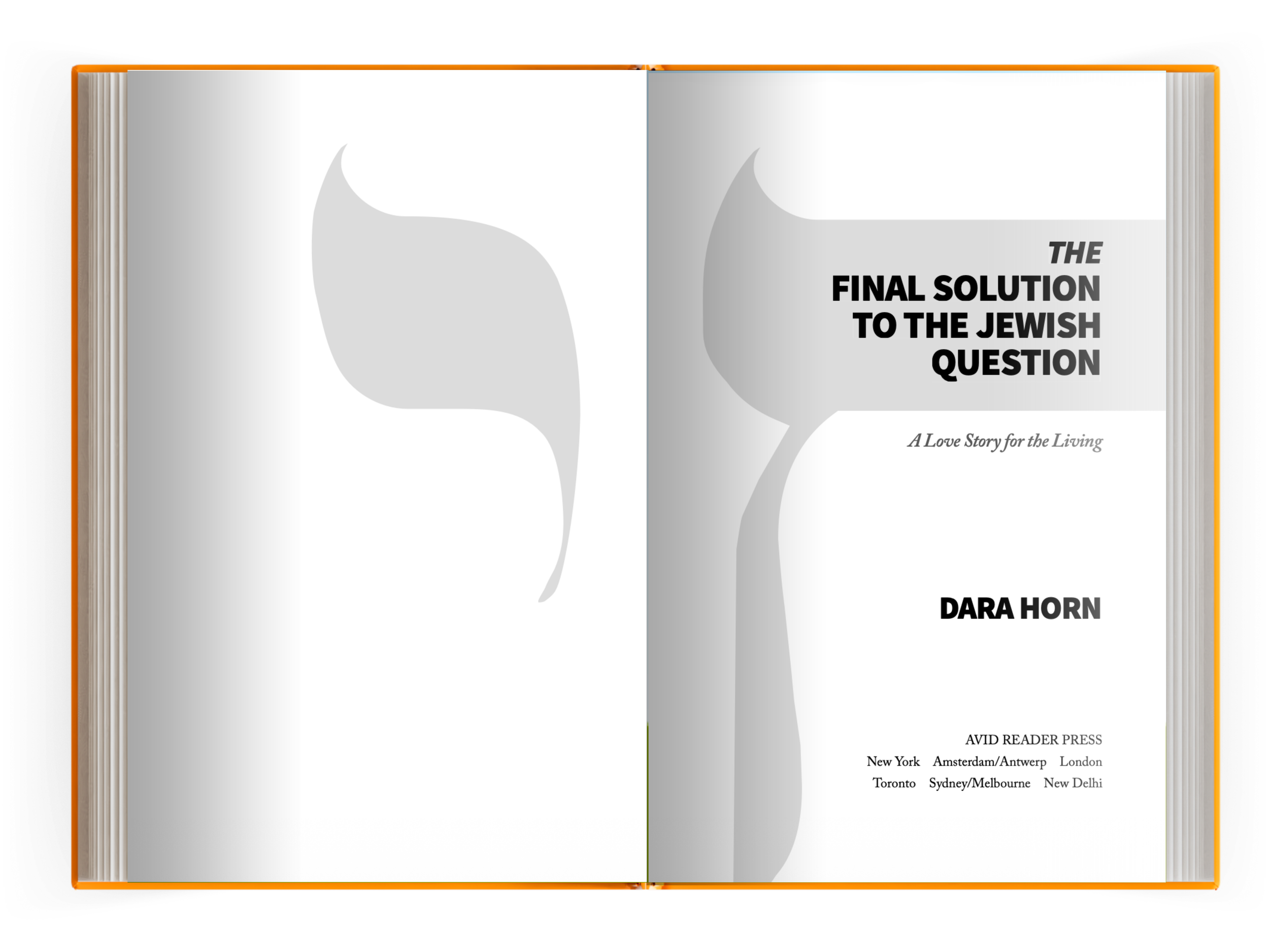
This one needed weight without shouting. The title page pairs a large, abstract rendering of the Hebrew letter chai, meaning life, with a bold, stacked sans-serif title. Chai sits behind the text in negative space, quiet but unmistakable: when they try to silence life, the answer is to shout louder. The italic "THE" and italic subtitle soften the hard edges of the title just enough.
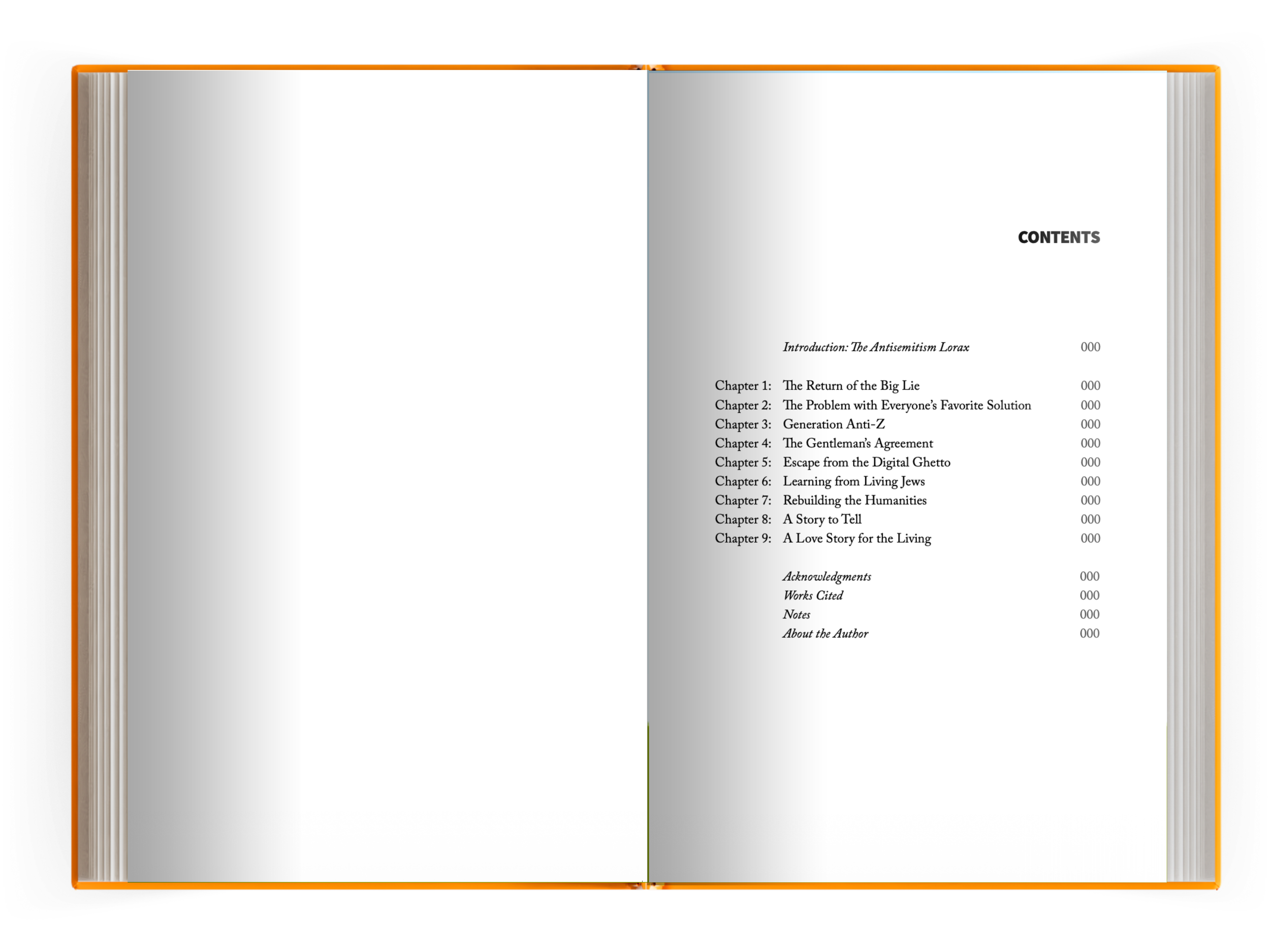
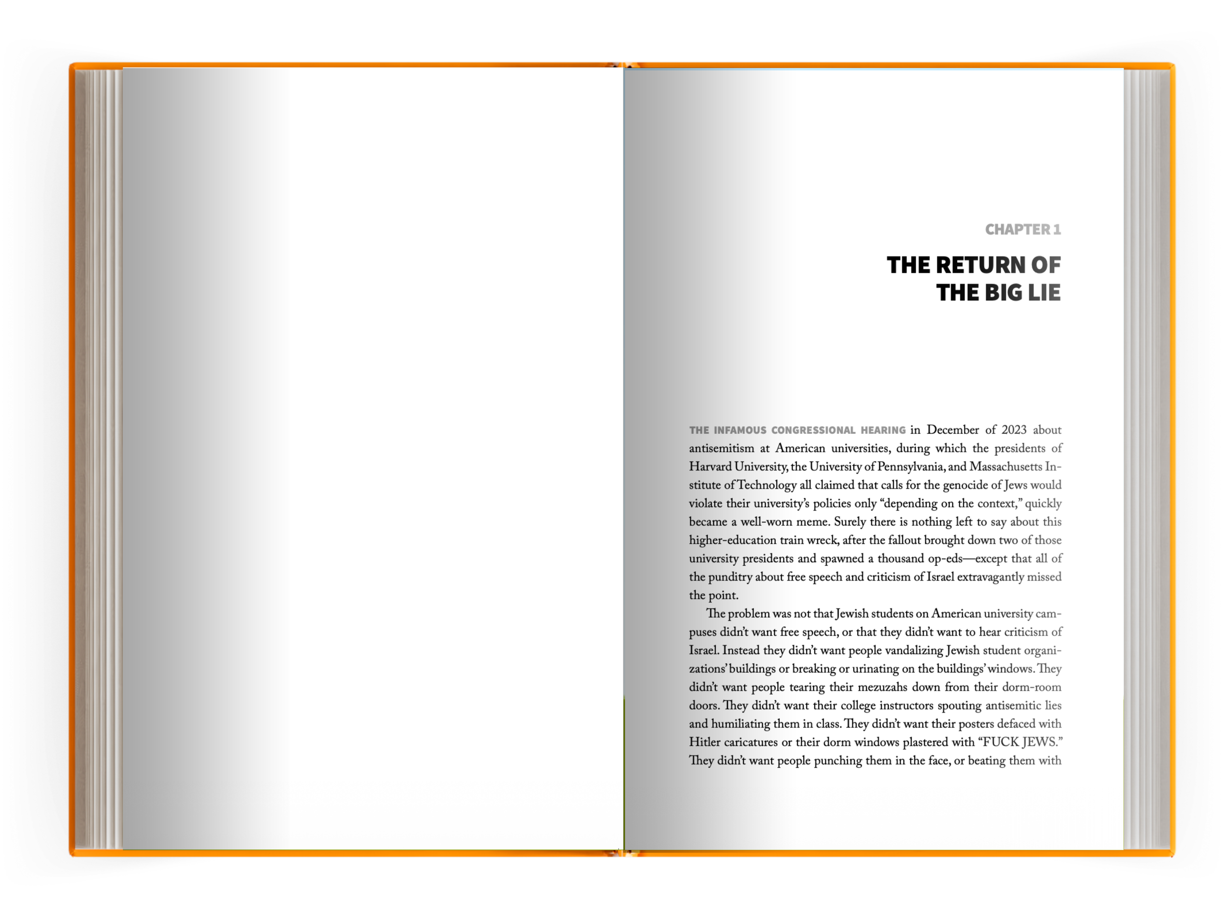
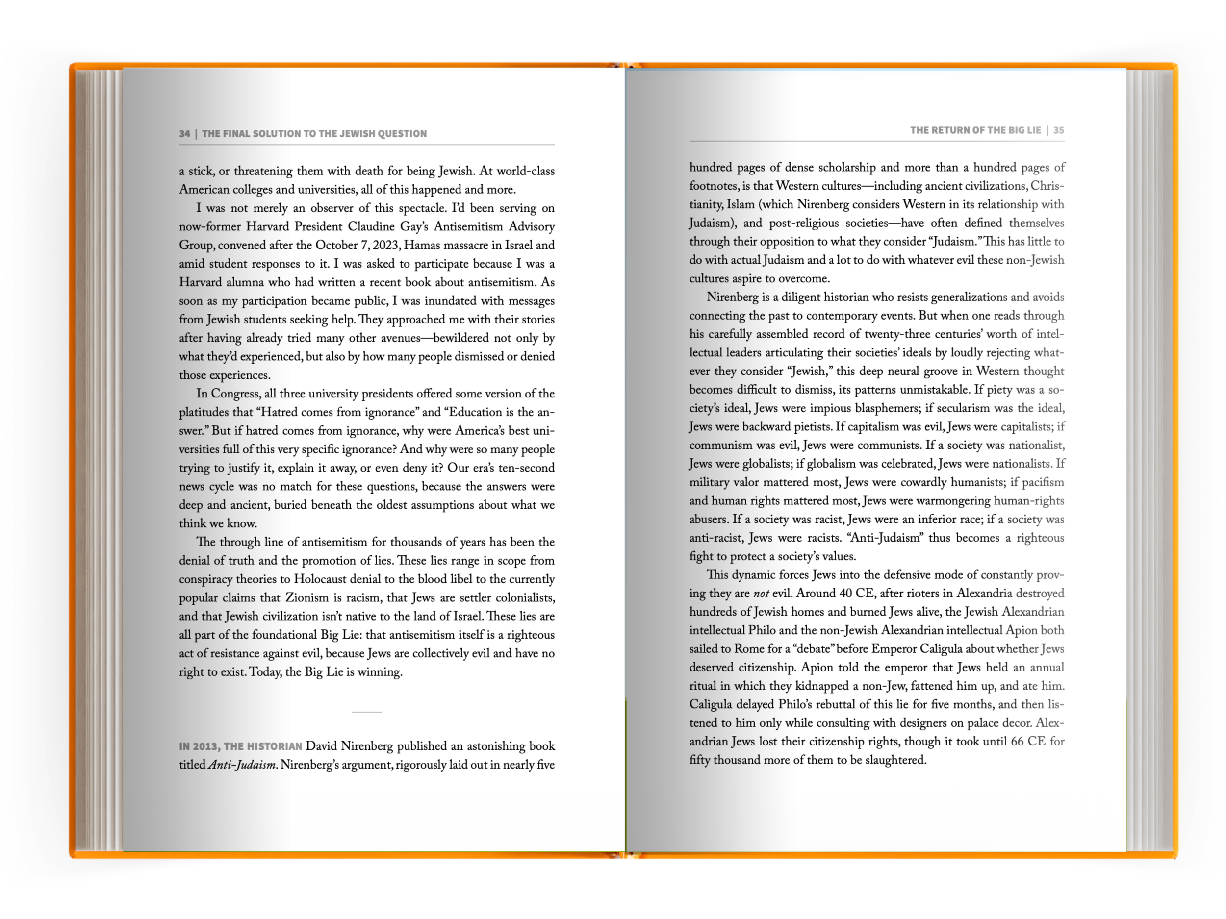
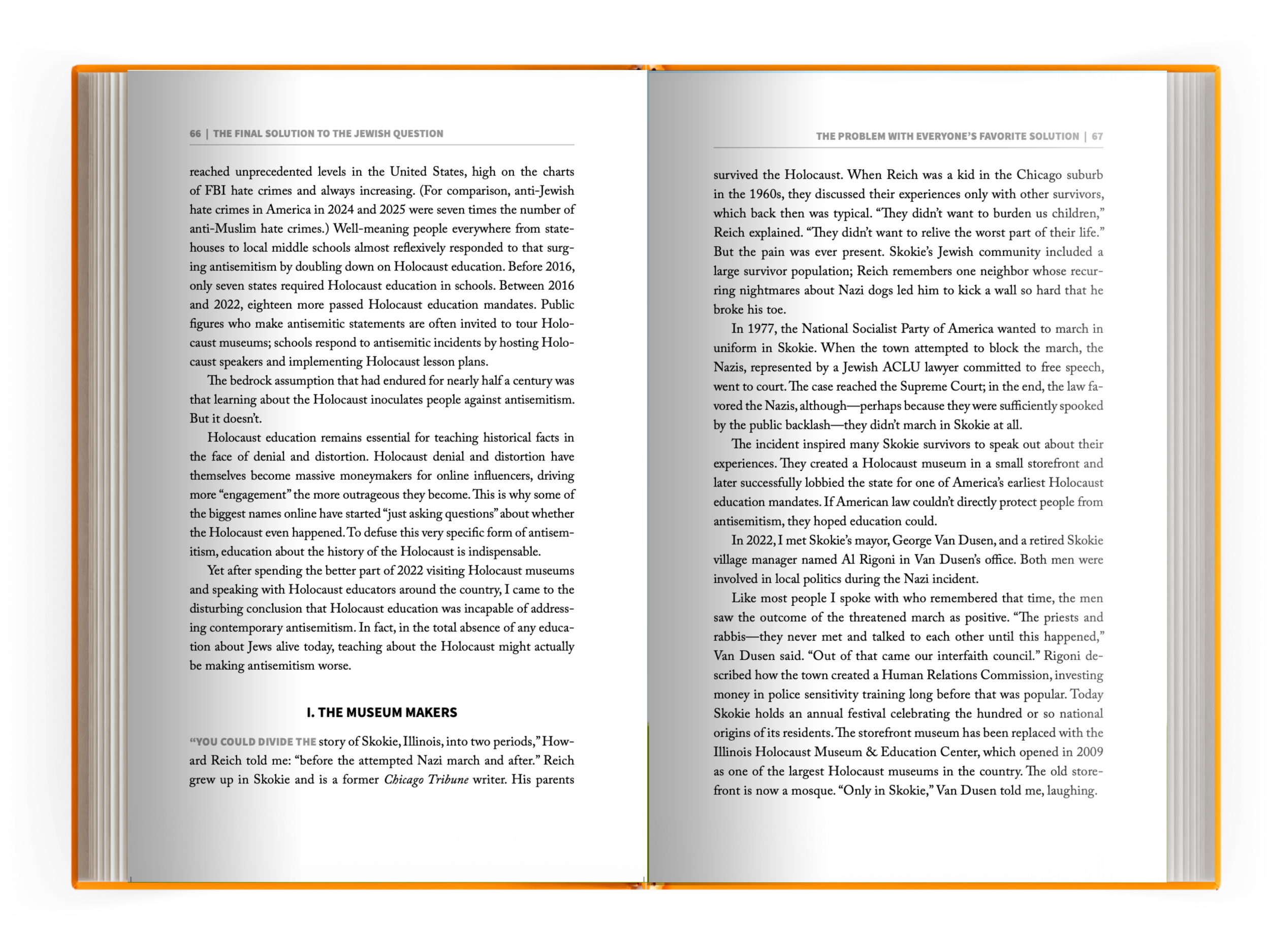
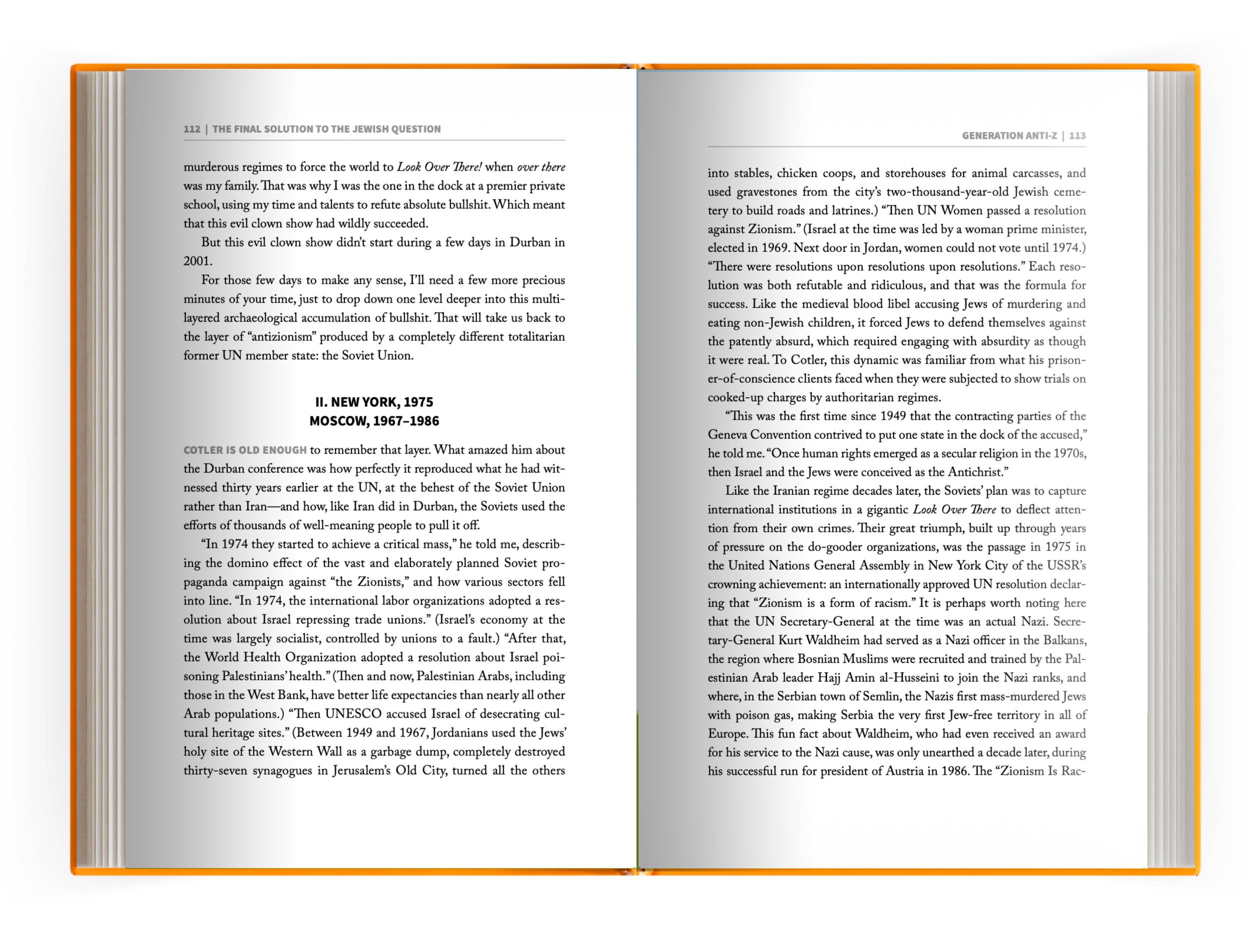
The interior stays clean and serious. Contents is straightforward serif, no ornament, letting nine blunt chapter titles do the work. Chapter openers use a small-caps kicker over a bold, sans-serif headline, then drop straight into text, no drop caps, no flourish. The opening paragraphs lead with a bolded, small-caps phrase instead, which gives the reader a foothold without softening the tone.
The goal was a design that gets out of the way so the subject can carry the book, while chai stands guard in the background, refusing to be erased.